Quick answer
No, the published 2026 design guidance does not show that high contrast tile has lost its place. Daltile features both black and white checkerboard and softer tonal versions, while MSI includes restrained neutrals alongside expressive patterns. These are manufacturer design directions, not Austin sales rankings.1 2 For your winter refresh, judge contrast by the room around it, not a claim that bold tile is finished.
1. What the 2026 sources actually say
Daltile's April 2026 checkerboard article shows classic black and white bathroom floors, beige and white combinations, and colorful alternatives. Its point is that scale and tone can change the same pattern, not that every home needs quieter tile.1
MSI's official 2026 lookbook offers creamy surfaces and subtle patterns in Light and Luster, but also earthy contrast in Vintage Villa and checkerboard in Velvet Truffle.2 That gives homeowners more than one legitimate direction.
For late 2026 planning into early 2027, treat those announcements as a starting point. They do not establish what Austin homeowners bought most, and they cannot tell you whether your existing tile needs replacement.
2. Spot contrast overload in the whole room
A bold floor can feel busy when several unrelated patterns compete. Imagine a kitchen with strongly veined counters, a small geometric backsplash, two tone cabinets and a black and white floor. Each surface may be attractive separately, yet none gets a quiet background.
Start at the doorway and identify the surface you want to notice first. If it is the floor, simplify the surrounding finishes. If the countertop is the feature, a softer tile pairing may be the better supporting choice.
In an open Mueller floor plan, include the dining area and visible hallway in that decision. In a compact Hyde Park powder room, the doorway may contain the pattern neatly. Those are design recommendations, not neighborhood popularity claims.
Contrast also comes from joints. Daltile explains that contrasting grout outlines individual tiles and emphasizes their layout.3
3. Where bold tile still earns its place
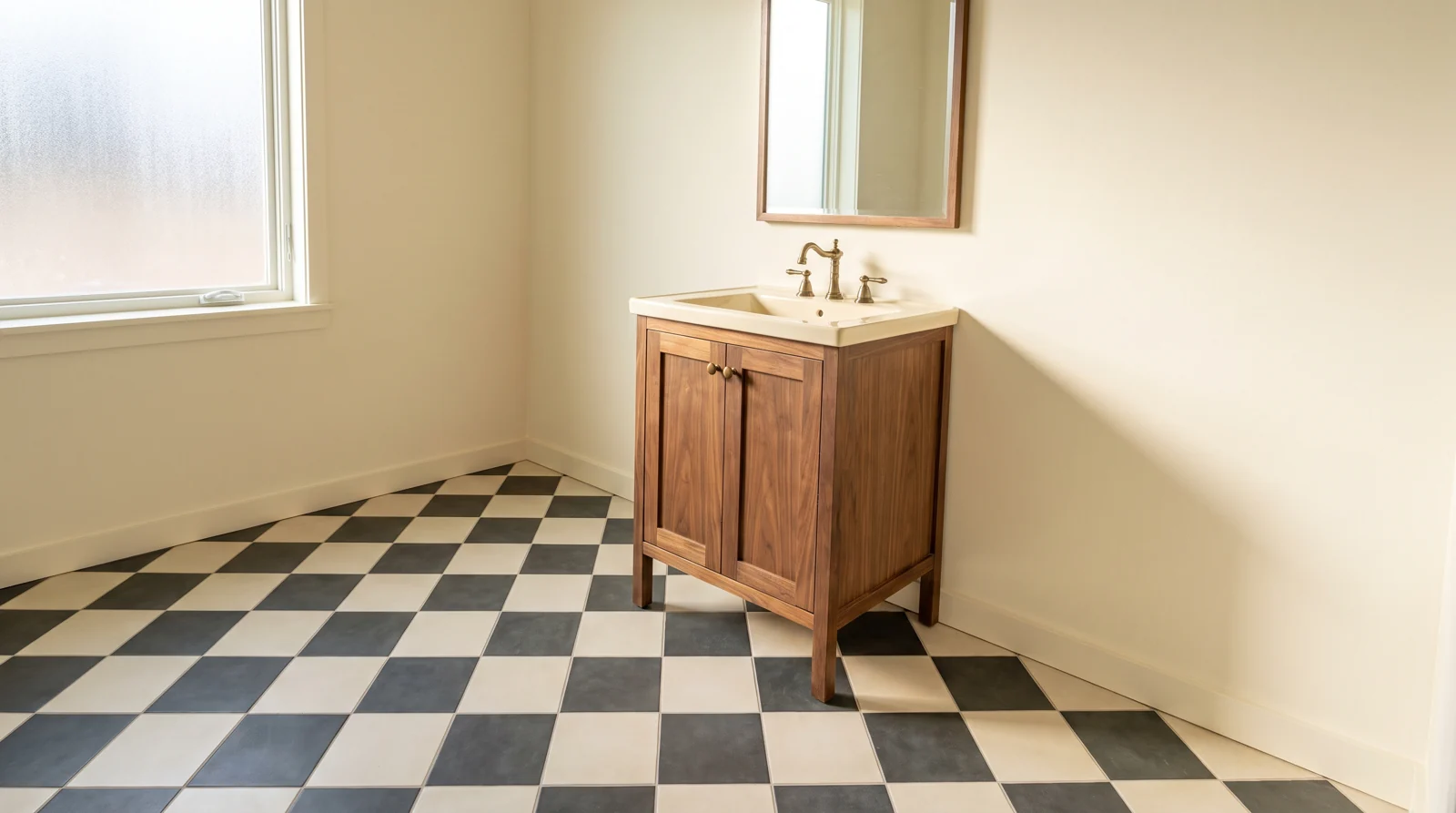
A cream and charcoal checkerboard can work well in a powder room with plain walls and a simple wood vanity. The room has a clear boundary, and the floor supplies the character without asking every finish to perform.
A patterned backsplash can also work as the single feature against restrained counters. Avoid automatically carrying a second strong pattern across the floor. The useful question is whether the two surfaces compete from the normal viewing position.
Keep sound existing tile if you like its geometry. Try simpler wall paint, fewer accessories or a calmer vanity finish before committing to demolition. If tiles are loose, cracked or uneven, arrange an assessment rather than treating the issue as a color problem. Our tile installation service is a starting point for discussing replacement scope.
4. Soften the pattern without flattening the room
Changing the distance between two colors can preserve a pattern while reducing its visual punch. Daltile illustrates this with beige and white checkerboard, including an open interior setting.1
Consider three design options rather than three assumed price tiers.
- Good: Keep sound bold tile and quiet the walls, countertop accessories and nearby fabrics.
- Better: For a new floor, compare cream with warm taupe rather than bright white with near black.
- Best: Develop the tile pair, grout sample and room layout together before ordering either color.
Best means the most complete decision process, not the most expensive material. Warm colors can still create strong contrast, so judge the actual pairing rather than relying on color names.
5. Make the installation plan match the drawing
Two tiles that look good together are not automatically a workable checkerboard pair. Ask the installer to confirm their actual dimensions, thickness, edge treatment and suitability for the intended floor. Decide how the pattern meets the doorway and vanity before material quantities are finalized.
A graphic layout makes awkward perimeter cuts particularly noticeable. Discuss a dry layout and balanced cuts rather than expecting the grid to follow every wall. The existing tile layout planning guide covers that separate installation issue.
Do not choose bathroom tile on color or sheen alone. Daltile notes that slip resistance measurements are only one consideration; water, dirt, footwear and other conditions also matter.4 Confirm the exact product's recommended use, then plan substrate preparation, transitions and installation before setting a hosting deadline.
6. Bring a useful sample and quote checklist
Compare a repeated group of tiles, not one isolated square. Place the proposed pair beside the countertop and cabinet sample. Daltile recommends viewing grout samples with the tile in the actual space because lighting affects their appearance.4 For a lasting decision, request a small grouted mockup and follow its curing instructions before approval.
Bring these details to the conversation:
- Room dimensions, doorway photos and the finishes you intend to keep.
- Both tile selections, the proposed pattern and the grout choice.
- Questions about demolition, substrate repair, cuts, transitions and spare tile for each color.
- Your household access needs and preferred completion window, with supply and scheduling still to be confirmed.
Use our grout selection guide for the joint decision. Then contact CC Floors Austin or call 512-769-2292 to discuss samples and a written installed quote. Project conditions, product availability and final selections determine the scope.
Related winter reading
- Cream Paint, Dark Tile and the Winter Contrast Test
- Warm Mineral Flecks in Commercial Carpet Tile for Winter 2026
- Soft White or Almond Ceramic Tile for Austin Winter Kitchens
Frequently asked questions
Is black and white checkerboard tile outdated in 2026?
No. Daltile's April 2026 design article includes classic black and white bathroom checkerboard alongside tonal alternatives. That supports it as an available design direction, not a claim about local sales.
Will softer tile make my small bathroom look bigger?
It may feel less visually busy, but it does not add space. Compare the full repeat and surrounding finishes before deciding whether softer contrast improves your particular room.
Can grout alone make patterned tile calmer?
Grout closer to the tile color reduces joint emphasis, while contrasting grout highlights tile shapes. It cannot remove the contrast already printed into a patterned tile or created by two different tile colors.
Should I replace bold tile before winter visitors arrive?
Not just because of a trend forecast. Keep sound tile you enjoy, and confirm assessment, materials, preparation and installation timing before scheduling a replacement around visitors.
Sources and resources
- Daltile: Checkerboard Reimagined, April 14, 2026
- MSI: 2026 Design Trends at a Glance
- Daltile: How to Choose the Right Grout Color for Your Tile
- Daltile: Tile and Natural Stone FAQs
Discuss your winter project
Thank you for considering CC Floors Austin. Request a project consultation, call 512-769-2292, text 713-444-4625, or email dan@austinflooringco.com. Confirm measurements, material selection, preparation and scheduling in a written scope before work begins.